projects
SWAG

overview
Branding design for the oral care brand “SWAG”.
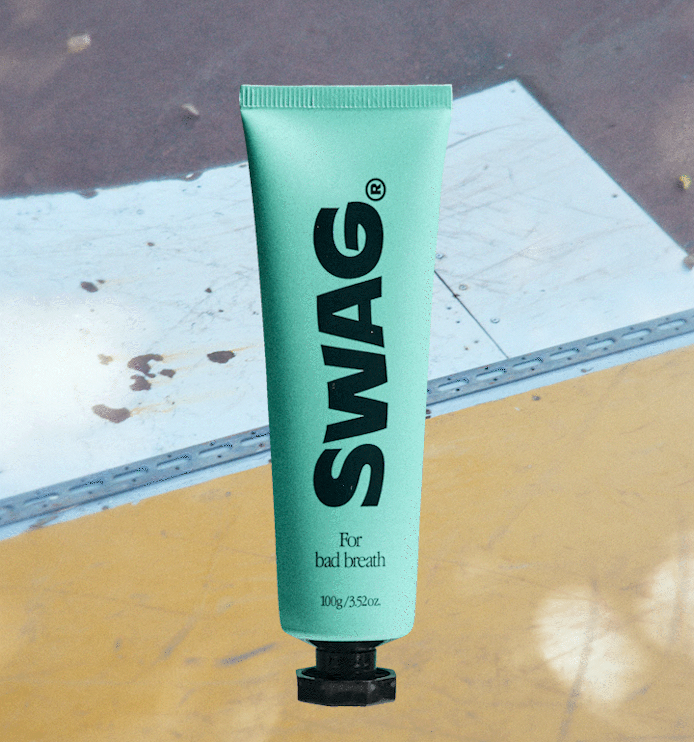
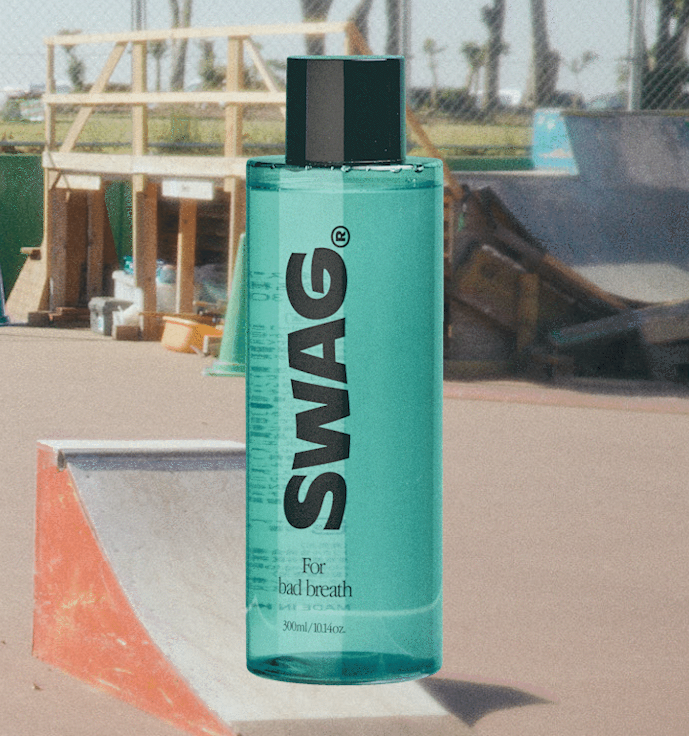
“SWAG” was developed as a product specifically for bad breath. The product formula uses the maximum amount of super mint possible, giving it its unique refreshing flavor.
According to a customer survey, people are more concerned about their bad breath now than before COVID-19; and the “bad breath problem” has quickly emerged as a stressful issue when wearing a mask.
terminal Inc. worked with TRICLE LLC. in creating the brand worldview, from concept making and logo design to key visuals, package design, and e-commerce site production.
オーラルケアブランド“SWAG”のブランディングデザイン。
バッドブレス専用の商品として開発された”SWAG”。スーパーミントがMAXに配合され、爽快感のあるフレーバーが特徴の商品。
カスタマー調査によると、コロナ以前よりも⾃⾝の⼝臭が気になり、マスク着⽤時のストレスに、『⼝臭問題』が急浮上していた。
terminal Inc.では、TRICLE LLC.と協働し、コンセプトメイキング、ロゴデザイン、キーヴィジュアル、パッケージデザイン、EC site制作など、世界観作りを担当しました。
goal
- concept development
- logo design
- key visual design
- web site design
- graphic design for in-store display
- shooting management
- コンセプト開発
- ロゴデザイン
- キーヴィジュアルデザイン
- webサイトのデザイン
- 店頭ツールのグラフィックデザイン
- 撮影マネジメント
idea
Create a brand that stands out on the sales floor by triggering UGC on social media.
As a completely new brand, there was an immediate need to establish a solid worldview that users would want to incorporate into their daily lives. At the same time, because this brand offers a product for bad breath prevention, we wanted to create a refreshing feeling as the first impression.
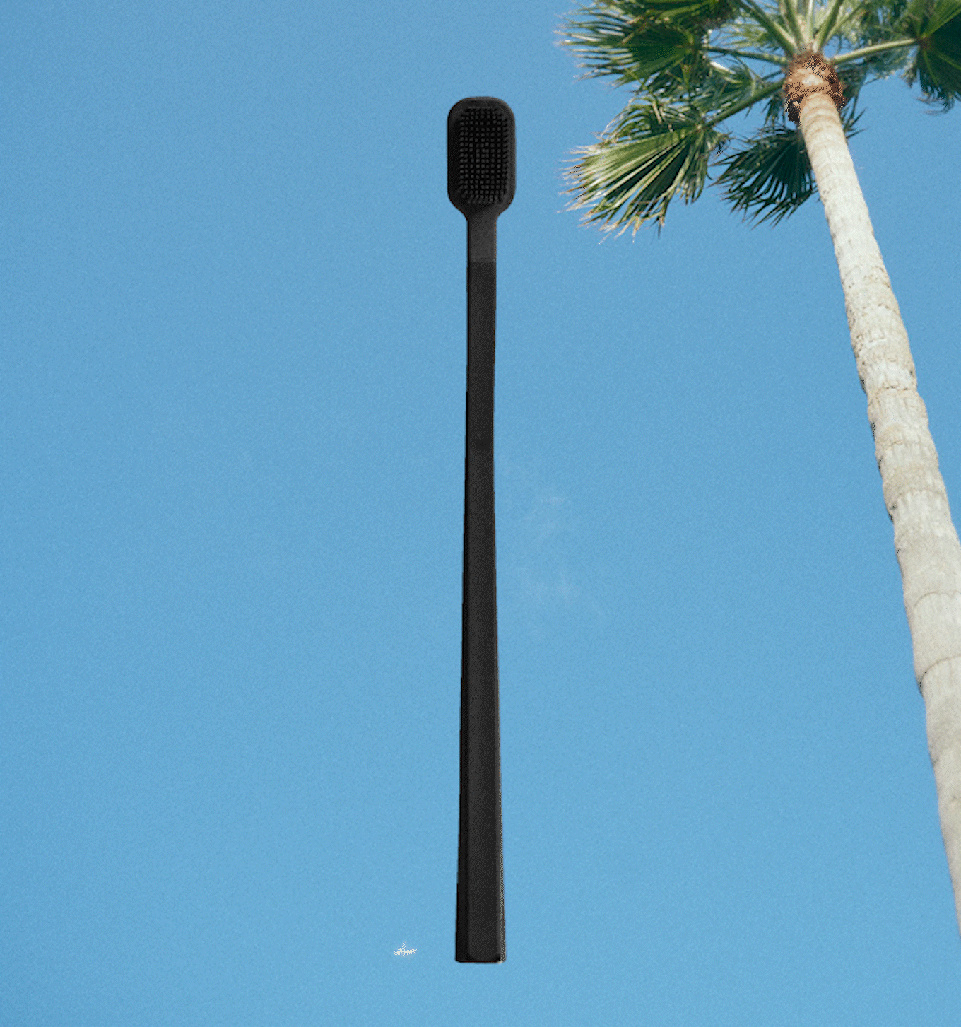
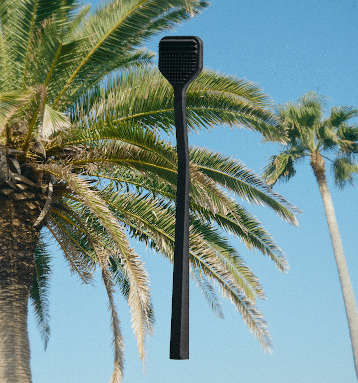
The brand image was based on West Coast skaters in the 90’s because 1. the West Coast connects to a fresh and invigorating feeling, and 2. skaters just seem to be popular.
The logotype is based on the idea of “good breath”, so we used a soft wave shape, like a puff of breath.
The brand color is emerald green, like a summertime pool, to express freshness.
As a playful element, we designed a character standing like Baikinman, a bad breath representative, and a spray texture that feels breath-like and plays into street graffiti.
For the key visuals, our goal was to increase brand recognition while triggering UGC on social networking sites. We shot scenes based on the brand image, of an imaginary user holding the product with the sky as the background.
Because the main sales point is the e-commerce site, we used a lot of video to give users a concrete image of how to use the products, all while better presenting the brand worldview.
The packaging, store fixtures, and POP were designed to stand out on the sales floor so as to present itself as a block of the brand color.
SNSでUGCを誘発し、売り場で異彩を放つブランドを作る
歯ブラシや歯磨き粉としては高価格帯にあたる商品構成であり、全くの新規立ち上げブランドであるため、ユーザーが自分の生活の中に積極的に取り入れたいと思える確固たる世界観を素早く確立することが必要であった。また、それとともにバッドブレス対策商品のため、”爽快な気分になれるブランド”という第一印象を大切にしたいと考えた。
そこで、西海岸ってなんだか爽やかで爽快な感じがするし、スケーターってモテそうだからという理由から、90年代の西海岸スケーターたちがこぞって使っているようなイメージをブランドイメージとして設定した。
ロゴマークはGood Breathをモチーフにした、息のようにふわっと湾曲したロゴタイプとした。
ブランドカラーは真夏のプールのようなエメラルドグリーンを採用し、爽やかさを表現。
遊びの要素として口臭の権化のようなバイキンマン的な立ち位置のキャラクターと、息っぽさとストリートを感じるようなスプレーのテクスチャをデザインした。
キーヴィジュアルは、SNSでUGCを誘発しながら知名度を上げることを意識し、設定したブランドイメージを元に空抜けで仮想のユーザー像が商品を持っているシーンを撮影した。
主な売り場がECサイトになることから、ECサイトでは動画を多用し、世界観を感じながらも使用シーンが具体的にイメージできるよう設計した。
パッケージや店頭什器、POPは、売り場で異彩を放つことをテーマにブランドカラーの塊が店頭で出来上がるようデザインしている。
—
まだ発売から間もないが、ロフトでの全国展開が決定し、メディアにも取り上げられるなど好調な滑り出しを切っている。
スーパーミント配合でシャキっと爽快な気分になれるのでぜひ使ってみてください。
team
art director : yoshio nakada , terminal Inc.
designer : marie endo / yuki shikaze , terminal Inc.
producer : taku uegaki / tacchy , TRICLE.LLC
photographer : noriyuki edamatsu
stylist : yukina imafuku
hair & make up : tomomi taniguchi / yumi asakawa
web developer : Konel Inc.
executions